Add Angular Material 16 Tutorial
In this tutorial, our angular 16 application will be enhanced with Angular Material v16, which will allow us to create a high-quality user interface for our applications. Following that, we'll build a navigation UI using the Material toolbar, sidenav, buttons, and icons components from Material Design.
Setting up Angular Material 16
Because we'll be styling our app's user interface with Material Design, we'll need to include Angular Material in our angular 16 project.
Fortunately, all it takes is a single command to accomplish this. To begin, open a new terminal and enter the commands listed below:
$ cd ./ngsimplecrm
$ ng add @angular/material
The command will ask you to Choose a prebuilt theme name, or "custom" for a custom theme: (Use arrow keys)
- Indigo/Pink
- Deep Purple/Amber
- Pink/Blue Grey
- Purple/Green
Let’s choose Deep Purple/Amber.
You’ll be also asked if you want to Set up HammerJS for gesture recognition? (Y/n) Choose the default answer which is Yes. And if you want to Set up browser animations for Angular Material? (Y/n) You can also choose Yes.
That's all there is to it! Your application has been configured to use Angular Material v16.
Importing Angular Material Components
After that, you need to import the Angular Material components that you want to use in your project which are MatToolbarModule, MatSidenavModule, MatListModule, MatButtonModule and MatIconModule.
Open the src/app/app.module.ts file and add the following updates:
import { BrowserModule } from '@angular/platform-browser';
import { NgModule } from '@angular/core';

import { HttpClientModule } from '@angular/common/http';
import { BrowserAnimationsModule } from '@angular/platform-browser/animations';
import { MatToolbarModule, MatIconModule, MatSidenavModule, MatListModule, MatButtonModule } from  '@angular/material';

import { AppRoutingModule } from './app-routing.module';


// [...]

@NgModule({
  declarations: [
      // [...]
  ],
  imports: [
    BrowserModule,
    BrowserAnimationsModule,
    HttpClientModule,
    AppRoutingModule,
    MatToolbarModule,
    MatSidenavModule,
    MatListModule,
    MatButtonModule,
    MatIconModule
  ],
  providers: [],
  bootstrap: [AppComponent]
})
export class AppModule { }
We import the following Material components modules for building our navigation UI:
- MatToolbarModule which provides
<mat-toolbar>and<mat-toolbar-row>components. - MatSidenavModule
- MatListModule
- MatButtonModule which provides
mat-buttonandmat-icon-button. - MatIconModule which provides
<mat-icon>.
Note: Make sure you import the Angular Material modules after Angular's BrowserModule, as the import order matters for NgModules.
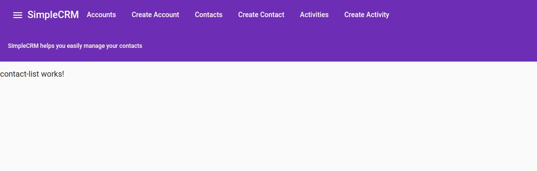
Angular 16 Material Toolbar Example
The Material toolbar components are intended to be used to add containers for headers, titles, and actions. To create and structure toolbars for your Angular 16 application, we can use various components such as <mat-toolbar> and <mat-toolbar-row>.
Open the src/app/app.component.html file and start by adding the toolbar:
<mat-toolbar color="primary">
  <mat-toolbar-row>
    <button mat-icon-button>
      <mat-icon (click)="sidenav.toggle()">menu</mat-icon>
    </button>
    <h1>SimpleCRM</h1>
    <span class="menu-spacer"></span>
    <div>
      <a mat-button [routerLink]="'/accounts'"> Accounts </a>
      <a mat-button [routerLink]="'/create-account'"> Create Account </a>
      <a mat-button [routerLink]="'/contacts'"> Contacts </a>
      <a mat-button [routerLink]="'/create-contact'"> Create Contact </a>
      <a mat-button [routerLink]="'/activities'"> Activities </a>
      <a mat-button [routerLink]="'/create-activity'"> Create Activity </a>

    </div>
  </mat-toolbar-row>

  <mat-toolbar-row>
      <span style="font-size: 12px;">SimpleCRM helps you easily manage your contacts</span>
    </mat-toolbar-row>
</mat-toolbar>
We use a primary color for our toolbar. Next, we create tow toolbar rows using the <mat-toolbar-row>. In the first row, we add an icon button (using mat-icon-button)with a Material icon (<mat-icon>) to toggle the sidenav menu which we'll add next. Next, we add a bunch of navigation buttons using <a> tags with mat-button.
You can set the color of a <mat-toolbar> component by using the color property. By default, toolbars make use a neutral background color depending on the current theme (light or dark). This can be changed to primary, accent, or warn.
This is a screenshot of our toolbar:
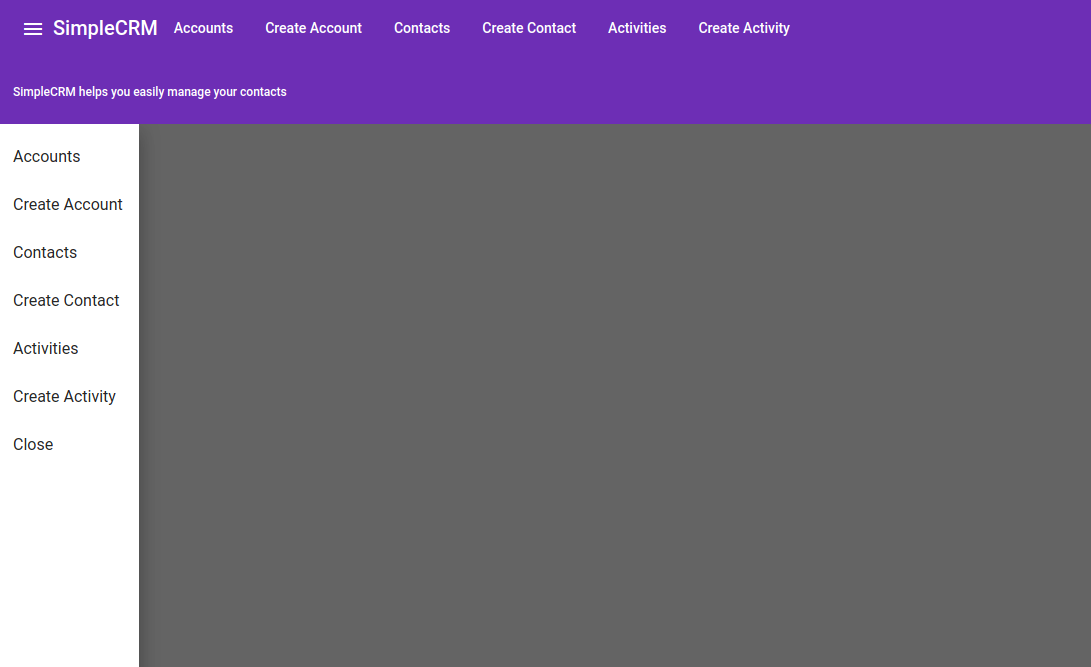
Angular 16 Material Sidenav Example
According to the docs:
The sidenav components are designed to add side content to a fullscreen app. To set up a sidenav we use three components:
<mat-sidenav-container>which acts as a structural container for our content and sidenav,<mat-sidenav-content>which represents the main content, and<mat-sidenav>which represents the added side content.
In the same src/app/app.component.html file, add:
<mat-sidenav-container>
  <mat-sidenav #sidenav>
    <mat-nav-list>

      <a mat-list-item [routerLink]="'/accounts'"> Accounts </a>
      <a mat-list-item [routerLink]="'/create-account'"> Create Account </a>
      <a mat-list-item [routerLink]="'/contacts'"> Contacts </a>
      <a mat-list-item [routerLink]="'/create-contact'"> Create Contact </a>
      <a mat-list-item [routerLink]="'/activities'"> Activities </a>
      <a mat-list-item [routerLink]="'/create-activity'"> Create Activity </a>
      <a mat-list-item (click)="sidenav.toggle()" href="" mat-list-item>Close</a>

    </mat-nav-list>
  </mat-sidenav>
  <mat-sidenav-content>
    <div style="height: 88vh;">

      <router-outlet></router-outlet>
    </div>
  </mat-sidenav-content>
</mat-sidenav-container>
We used a Material navigation list to create a list of buttons using <mat-nav-list> and mat-list-item. We also added a #sidenav template reference variable to <mat-sidenav #sidenav> to be able to call its toggle() method from the menu icon in the toolbar so we toggle it on and off ( <mat-icon (click)="sidenav.toggle()">menu</mat-icon>)
This is a screenshot of our UI:
Conclusion
In this tutorial, we added Angular Material to our angular 16 app, allowing us to create a professional-grade UI for our apps. Following that, we built a navigation UI using the Material toolbar, sidenav, buttons, and icons components.
In the previous tutorial we’ve seen how to consume a REST API with Angular 16 HttpClient.
We’ve also added component routing to our application. Now, let’s learn to create the UI using Angular Material 16.
In the following tutorial, we'll create a CRUD interface for creating, reading, updating, and deleting items from our CRM REST API using our table and form UI.