Bootstrap 5 with Sass and Gulp 4 Tutorial by Example
The most popular Bootstrap CSS and JavaScript framework for styling user interfaces is coming with a new version - Bootstrap 5. In this tutorial, we will learn how to use the latest Bootstrap 5 version with Gulp 4 and Sass to style and build a responsive mobile-first example app.
We'll use JavaScript to fetch data from a JSON endpoint that exports the latest posts from Techiediaries.
Bootstrap is the most popular and widely used, among developers worldwide, open-source framework for building responsive UIs with HTML, CSS, and JavaScript. At this time, Bootstrap 4 is the major production release of bootstrap but soon we'll have a Bootstrap 5 version that will bring many major changes and most importantly removing jQuery as a dependency, and dropping support for IE 10 and 11.
Major changes include:
- Dropping jQuery in favor of vanilla JavaScript
- Rewriting the grid to support columns placed outside of rows and responsive gutters
- Migrating the documentation from Jekyll to Hugo
- Dropping support for IE10 and IE11
- Moving testing infrastructure from QUnit to Jasmine
- Adding custom set of SVG icons
- Adding CSS custom properties
- Improved API
- Enhanblogced grid system
- Improved customizing docs
- Updated forms
Throughout this Bootstrap 5 tutorial, you will learn how to set up your development environment with Sass and Gulp 4, and create and style a page with Bootstrap 5 and Sass.
- Setting up a development environment with Bootstrap 5, Sass, Gulp 4 and BrowserSync
- Building a Bootsrap 5 blog page and fetching posts with JavaScript,
- Fetching Posts with JavaScript Fetch and Appending to the DOM
- Customizing the Bootstrap 5 Theme Colors with Sass Variables
- Including Bootstrap 5 Sass File
- Creating a Gulp Configuration File
- Installing Bootstrap 5, Sass and Gulp 4
- How to Use Bootstrap 5 with Sass, Gulp 4 and BrowserSync
There are various ways to use Bootstrap 5 including importing the stylesheet and scripts from a CDN via <link> and <scripts> tags, and using Sass to take benefits of the Bootstrap 5 CSS framework.
Prerequisites
In order to follow this tutorial, you need to have Node.js installed on your machine. This is required for our front-end development tools such as Sass and Gulp but that's not required if include Bootstrap 5 using <script> and <link> tags.
If you don't have Node.js installed on your machine, simply head to the official website and download the binaries for your operating system.
You also need to have a basic knowledge of HTML and CSS.
Installing Bootstrap 5, Sass and Gulp 4
After you have installed Node on your development machine, head over to a new terminal and run the following command to install the Gulp CLI:
$ npm install --global gulp-cli
Gulp CLI will be installed globally on your machine.
Next, we need to install Gulp, BrowserSync, Gulp Sass and Bootstrap 5 using NPM.
Go back to your terminal and run the following command to create a package.json file by running the following command:
$ mkdir bootstrap5demo && cd bootstrap5demo
$ npm init
You'll be propmpted for some details such as your project's name and description. Enter them as you see fit.
After that, you'll have a package.json file inside your current folder:
{
  "name": "bs5demo",
  "version": "1.0.0",
  "description": "",
  "main": "index.js",
  "scripts": {
    "test": "echo \"Error: no test specified\" && exit 1"
  },
  "author": "",
  "license": "ISC"
}
Next, you need to run the following command to install Gulp 4, BrowserSync, Gulp Sass and Bootstrap 5:
$ npm install browser-sync gulp gulp-sass --save-dev
At the time of writing this tutorial, these versions will be installed:
Next, run the following command to install Bootstrap 5:
$ npm install bootstrap@next
$ npm install popper.js
This will install [email protected] and [email protected]
at the time of writing this tutorial.
Our package.json file should look like the following:
{
  "name": "bs5demo",
  "version": "1.0.0",
  "description": "",
  "main": "index.js",
  "scripts": {
    "test": "echo \"Error: no test specified\" && exit 1"
  },
  "author": "",
  "license": "ISC",
  "devDependencies": {
    "browser-sync": "^2.26.12",
    "gulp": "^4.0.2",
    "gulp-sass": "^4.1.0"
  },
  "dependencies": {
    "bootstrap": "^5.0.0-alpha1",
    "popper.js": "^1.16.1"
  }
}
Note: Please note that you need to add the next tag to install the latest Bootstrap 5 version at this phase.
Popper.js is a dependency of Bootstrap 5.
Creating a Gulp Configuration File
Next, create a gulpfile.js file in the root of your project's folder and add the following code:
var gulp        = require('gulp');
var browserSync = require('browser-sync').create();
var sass        = require('gulp-sass');

gulp.task('sass', ()  => {
    return gulp.src("./sass/*.scss")
        .pipe(sass())
        .pipe(gulp.dest("dist/"))
        .pipe(browserSync.stream());
});

gulp.task('start', gulp.series('sass', function() {

    browserSync.init({
        server: "./"
    });

    gulp.watch("sass/*.scss", gulp.series('sass'));
    gulp.watch("./*.html").on('change', browserSync.reload);
}));

gulp.task('default', gulp.series('start'));
We start by importing the gulp, gulp-sass and browser-sync dependencies using the Node require() method, next we create a first Gulp task named sass which compiles any Sass files inside the sass folder to a CSS file that will be later included in our HTML file to provide styles for our UI.
Next, we create a second Gulp task named start which simply starts a local development server and watches any changes on our project's folder. If a change is made the sass task executes again.
Finally, we use gulp.task('default', ['start']) allows you make the start, the default running task which will start the local development server and compile an Sass files when changes are made.
Including Bootstrap 5 Sass File
Next, head back to your terminal and add a sass/ folder in your project's folder, then create a file named styles.scss:
$ mkdir sass && cd sass
$ touch styles.scss
Next, open the sass/styles.scss file and add the following line to import the Sass files of Bootstrap 5 from the node_modules/ folder:
@import '../node_modules/bootstrap/scss/bootstrap.scss';
This will allow you to customize the default look and feel of Bootstrap 5 by setting your own values for the colors, sizes, spacings, etc.
Next, add a index.html file inside your project's folder and add the following HTML code:
<!DOCTYPE html>
<html lang="en">
    <head>
        <meta charset="UTF-8">
        <meta name="viewport" content="width=device-width, initial-scale=1.0">
        <title>Bootstrap 5 with Sass Tutorial</title>
        <link rel="stylesheet" href="dist/styles.css">
    </head>
    <body>
    <nav class="navbar navbar-expand-lg navbar-light bg-light">
        <div class="container-fluid">
            <a class="navbar-brand" href="#">Bootstrap 5 tutorial</a>
            <button class="navbar-toggler" type="button" data-toggle="collapse" data-target="#navbarSupportedContent"
                aria-controls="navbarSupportedContent" aria-expanded="false" aria-label="Toggle navigation">
                <span class="navbar-toggler-icon"></span>
            </button>
            <div class="collapse navbar-collapse" id="navbarSupportedContent">
                <ul class="navbar-nav mr-auto mb-2 mb-lg-0">
                    <li class="nav-item">
                        <a class="nav-link active" aria-current="page" href="#">Home</a>
                    </li>
                    <li class="nav-item">
                        <a class="nav-link" href="#">Blog</a>
                    </li>
                </ul>
                <form class="d-flex">
                    <input class="form-control mr-2" type="search" placeholder="Search" aria-label="Search">
                    <button class="btn btn-outline-success" type="submit">Search</button>
                </form>
            </div>
        </div>
    </nav>

    <div class="container-fluid">
        <div class="row d-flex justify-content-center">
            <div class="col-12 col-lg-6" id="postsDiv">

            </div>
            <div class="col-12 col-lg-4">
                <div class="card">
                    <div class="card-body">
                        <h5>Newsletter</h5>
                        <form action="#">
                            <div class="input-group my-3">
                                <span class="input-group-text" id="email-at">@</span>
                                <input type="email" class="form-control" placeholder="Email" aria-label="Email"
                                    aria-describedby="email-at" required>
                            </div>
                            <button type="submit" class="btn btn-block btn-primary">Subscribe</button>
                        </form>
                    </div>
                </div>
            </div>
        </div>
    </div>


        <script src="https://cdn.jsdelivr.net/npm/[email protected]/dist/umd/popper.min.js" integrity="sha384-Q6E9RHvbIyZFJoft+2mJbHaEWldlvI9IOYy5n3zV9zzTtmI3UksdQRVvoxMfooAo" crossorigin="anonymous"></script>
        <script src="https://stackpath.bootstrapcdn.com/bootstrap/5.0.0-alpha1/js/bootstrap.min.js" integrity="sha384-oesi62hOLfzrys4LxRF63OJCXdXDipiYWBnvTl9Y9/TRlw5xlKIEHpNyvvDShgf/" crossorigin="anonymous"></script>

    </body>
</html>
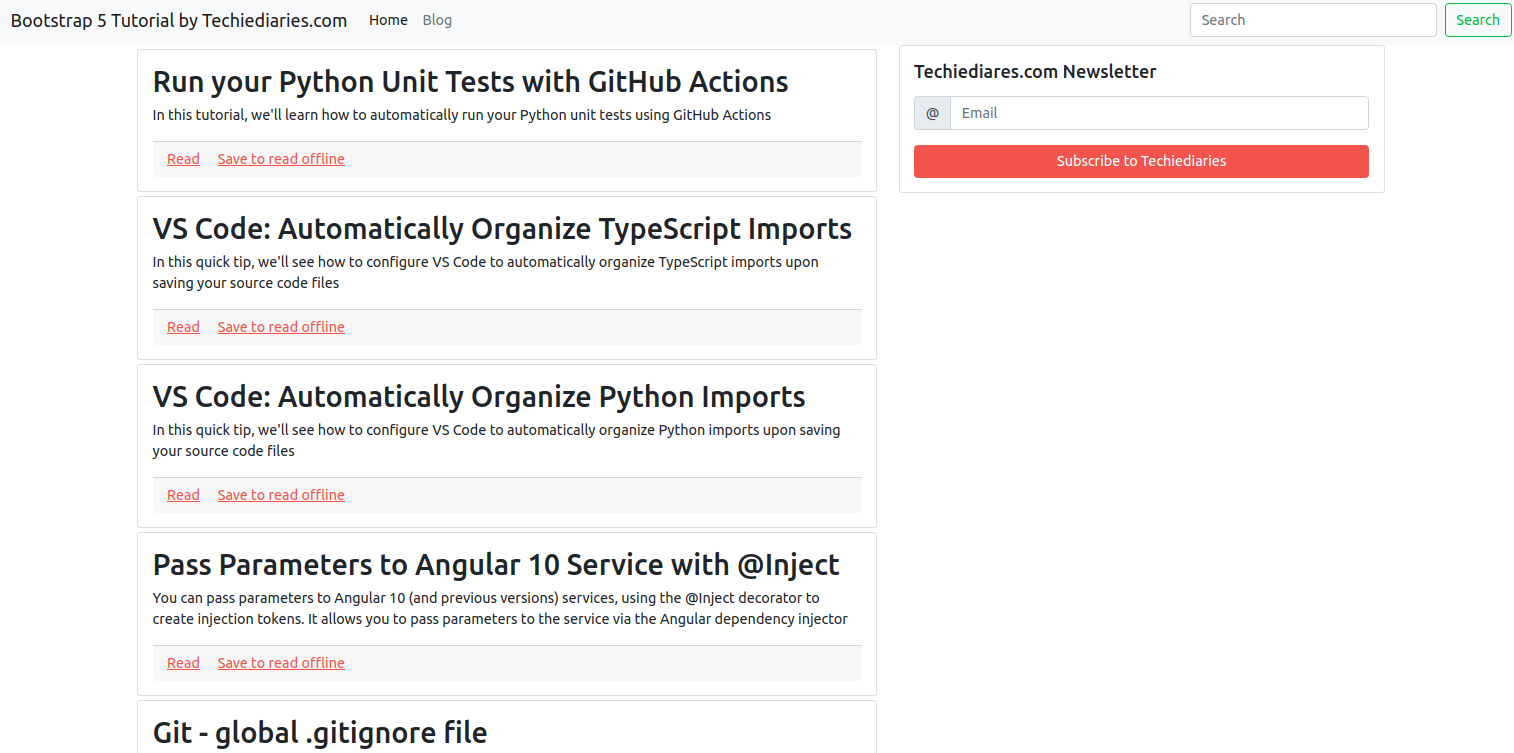
We start by adding a Bootstrap 5 navigation bar from the docs. Next, we add the main content area of the page. The first element is a container where we add two main rows -- the posts area that will contain Bootstrap 5 cards and the sidebar.
Fetching Posts with JavaScript Fetch and Appending to the DOM
Next, we need to add some JavaScript code for fetching posts, wrap them inside a Bootstrap 5 card, then append then inside the container <div> with the postsDiv ID:
   <script>
        let posts;
        document.body.onload = async (e) =>{
            console.log("document loaded!");
            posts = await fetch("https://www.techiediaries.com/api/feed.json").then(function(response) {
                return response.json();
            });
            posts.forEach(element => {
                let child = document.createElement('div');
                child.classList.add('mt-1');
                ['card'].forEach((v)=>{
                    child.classList.add(v);
                })


                child.innerHTML = `
                <div class="card-body">
                    <h2 class="card-title">${element.title}</h2>
                    <p class="card-text">${element.excerpt}</p>
                    <div class="card-footer">
                        <a href="${element.url}" class="card-link">Read</a>
                        <a href="#" class="card-link">Save to read offline</a>
                    </div>

                </div>
                `

                document.getElementById("postsDiv").appendChild(child);
            });

        }


        </script>
We use the Fetch API to fetch data from the JSON endpoint then we loop through the posts, wrap each post in a Bootstrap 5 card and append the element to our content <div>.
Customizing the Bootstrap 5 Theme Colors with Sass Variables
Sass enables you to easily customize the feel and look of your theme via the Bootstrap 5 variables.
Open the styles.scss file and update it as follows to customize the default theme colors:
// Changing the theme colors
$primary: #3ec89d;
$secondary: #3ab7ff;
$success: #65ff9f;
$info: #7164ff;
$warning: #ff9f65;
$danger: #ff457b;
$dark: #18181d;

@import '../node_modules/bootstrap/scss/bootstrap.scss';
These are only some variable but we can other variables which are responsible for the font family, sizing, and spacings, etc. Simply head to the _variables.scss file inside the node_modules/bootstrap folder and you'll be able find any variables that you can customize.
Conclusion
Bootstrap is a popular, open-source framework that provides pre-built components, and allows web designers and developers of all skill levels to quickly build responsive and mobile-first user interfaces. The latest version of Bootstrap -- Bootstrap 5 brings many new changes including removing jQuery as dependency. In this article, we've seen how to use Bootstrap 5 and Gulp 4 to build a responsive blog page and configure and customize the theme using Sass variables.
-
Date:
Buy our ebook: Angular 17 from Scratch - Build an ecommerce app step by step!

Subscribe to our Angular Newsletter and Get 4 Angular eBooks for Free
- Ebook 1: Angular standalone components
- Ebook 2: Learn Angular In 15 Easy Steps
- Ebook 3: Practical Angular: Build 5 Apps From Scratch!
- Ebook 4: Build a Movies App with Angular 18 and Tailwind