CSS Grid Layout Tutorial: Holy Grail Angular 10 UI
This CSS Grid layout tutorial is designed for Angular 10 developers that want to learn how to build responsive layouts with modern CSS. We'll first start with a general introduction to learn about the basic concepts and then we'll see how to use it within an Angular 7/8 app to create the famous holy grail layout.
In this tutorial, we’ll teach you how to use CSS Grid layout to easily build interfaces and responsive HTML layouts without resorting to using the old and complex CSS tricks for achieving the same results but instead using clean and easy to maintain CSS styles.
Grid layouts are common in the design of websites and web apps, and thanks to the CSS Grid layout in modern web browsers, we now have an easy way for creating these layouts.
CSS Grid layout is now supported in the major browsers such as Safari, Chrome, Firefox, and Edge so developers can start using it with more confidence and may also use fallbacks for older browsers.
In this first part of our tutorial, we’ll go through the basic concepts of CSS Grid before we build our Angular UI with it.
With CSS Grid layout:
- You’ll be able to easily create two-dimensional layouts without using complex CSS tricks and HTML tables,
- You can create layouts with simple HTML markup,
- You don’t need to use CSS frameworks like Bootstrap.
In this CSS Grid tutorial, you'll learn:
- What is a grid container and how to create it,
- What is an implicit and explicit grid,
- What're grid tracks and how to use them,
- What're grid gaps or gutters,
- How to position items using grid line numbers,
- How to span items across rows and columns,
- How to name grid lines,
- How to positioning items by line names,
- How to name and position items by grid areas, etc.
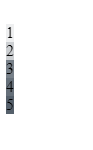
In a CSS Grid layout, you’ll have two main things, the container grid, and the items. For example:
<div style="display: grid;">
  <div style="background: #00112211;">1</div>
  <div style="background: #00112233;">2</div>
  <div style="background: #00112288;">3</div>
  <div style="background: #00112299;">4</div>
  <div style="background: #001122dd;">5</div>
</div>
By setting the CSS display property to grid, we turn the outer div into a grid container.
Note: You can create a grid container by simply applying the CSS
displayproperty to an HTML element like a<div>and gives it a value ofgridorinline-grid.
Since we didn’t apply any other properties, we’ll have a default grid that displays the items in rows similar to a vertical stack. Each item takes the full available width.
Note: The Grid items are simply the top-level children of the grid container.
This is a screenshot of our grid:

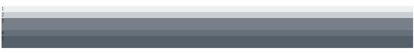
If you change the display property to inline-grid, items will not span the full available width:
We can see this layout as a one-dimensional grid with one column and 5 rows. But, CSS Grid allows us to create two-dimensional grids with multiple rows and columns.
CSS Grid's columns and rows
A CSS grid can have multiple columns and rows. We can use the grid-template-row and grid-template-column properties to control the layout of the grid by defining the number of columns of rows and their size.
We can update the previous grid without changing anything in the HTML markup but CSS. But, first, since we’ll need to add more CSS, let’s pull the inline styles into a separate CSS class.
This is the HTML markup:
<div class = "grid">
  <div class="item" style="background: #00112211;">1</div>
  <div class="item" style="background: #00112233;">2</div>
  <div class="item" style="background: #00112288;">3</div>
  <div class="item" style="background: #00112299;">4</div>
  <div class="item" style="background: #001122aa;">5</div>
</div>
The outer div has a grid class and each inner div has an item class. It’s up to you to choose the name of your classes and you can pick any names you see convenient.
Let's see how to use the grid-template-rows property to create row tracks:
.grid {
  display: grid;
  grid-template-rows: 20px 20px 40px 20px 40px;
}
We created a row track for each item by specifying a value in pixel (that represents the height of the row) in grid-template-rows template. You can also use other units like % or em, etc.
Just like rows, you can create column tracks by specifying values in the grid-template-columns template.
.grid {
  display: grid;
  grid-template-rows:    20px 20px 40px 20px 40px;
  grid-template-columns: 100px;
}
We have created one column track with a witdh of 100px:
If you want the column to take all the available width in the container, you can use the fraction unit denoted by fr:
.grid {
  display: grid;
  grid-template-rows:    20px 20px 40px 20px 40px;
  grid-template-columns: 1fr;
}
We've our previous grid:
 if you are familiar with this concept in Mathematics. Each cell in the matrix contains how much space the cell takes in the grid layout. We use the fr unit.
With the CSS Grid Layout, we have a new fr unit which stands for* fractional unit:
1frmeans 1 part of the available space,2frmeans 2 parts of the available space, etc.
How the space of each cell is calculated?
In our example, we have three columns and each column equally takes 1fr which means each column takes 1/3 of the available space.
We also have three rows and each row takes 1fr which means each row takes 1/3 of the available space.
This is exactly how our grid layout will look like when rendered in HTML except that we don’t have items to fill the sixth cell at the 2:3 position and the last row:

We can identify each cell by its row and column numbers in the row: column format.
By default, each <div> item has been given a position in the grid starting from left. The topmost element is positioned at cell 1:1 but you can also change the default positions.
CSS Grid gaps (Gutters)
You can add space between the grid items using the grid-column-gap and grid-row-gap properties which create gutters between columns and rows.
.grid {
  display: grid;
  grid-template-rows:    1fr 1fr 1fr;
  grid-template-columns: 1fr 1fr 1fr;
  grid-row-gap:    10px;
  grid-column-gap: 10px;
}

Note: You can also use
grid-gapas a shorthand for grid-row-gap and grid-column-gap. For example:grid-gap: 10px 10px;.
Positioning items in CSS Grid Layout
CSS Grid Layout allows you to control the position and size of each cell individually using the following properties:
grid-column-start,grid-column-end,grid-row-start,grid-row-end.
Or also their shorthands, grid-column and grid-row.
Let's see this with example. Let's apply the following styles to the first item:
div:nth-child(1) {
  grid-column-start: 2;
  grid-column-end: 3;
}
This will position the first item in the second column instead of the first column and will also cause all the other items to shift by one column:

Spanning items in CSS Grid Layout
Grid items span only one column and row tracks by default but can span multiple row and/or column tracks using the same grid-row-* and grid-column-* by simply setting the end position to a line which is more than one row or column away from the start.
For example, let's make the first item span the first two columns by adding the following styles:
div:nth-child(1) {
  grid-column-start: 1;
  grid-column-end: 3;
}

Let's also span the first item in across the first two rows and the last item across the two last rows:
div:nth-child(1) {
  grid-column-start: 1;
  grid-column-end: 3;

  grid-row-start: 1;
  grid-row-end: 3;
}

div:nth-child(5) {
   grid-row-start: 2;
  grid-row-end: 4;
}
This is our grid at this point of this tutorial:

.grid {
  display: grid;
  grid-template-rows:    1fr 1fr 1fr;
  grid-template-columns: 1fr 1fr 1fr;

  grid-row-gap:    1px;
  grid-column-gap: 1px;
}


div:nth-child(1) {
  grid-column-start: 1;
  grid-column-end: 3;
}

div:nth-child(3) {
  grid-column-start: 1;
  grid-column-end: 3;
}

div:nth-child(5) {
  grid-column-start: 1;
  grid-column-end: 4;
}
CSS Grid Areas
CSS Grid layout has other features like areas which give more flexebility when building layouts. We can give each cell of the grid a name as follows:
.grid {
  display: grid;
  grid-template-rows:    1fr 1fr 1fr;
  grid-template-columns: 1fr 1fr 1fr;

  grid-template-areas:   "header header header"
                         "content content sidebar"
                         "footer footer footer";

  grid-row-gap:    1px;
  grid-column-gap: 1px;
}
Next, we can position the items inside the grid using area names and the grid-area property as follows:
div:nth-child(1) {
  grid-area: header
}

div:nth-child(2) {
  grid-area: content
}

div:nth-child(3) {
  grid-area: sidebar
}

div:nth-child(4) {
  grid-area: footer;
  width: 50%;
  justify-self: start
}
div:nth-child(5) {
  grid-area: footer;
  width: 50%;
  justify-self: end
}
The fourth and fifth items are both assigned to the footer area so we need to adjust their widths and then use alignment properties like justify-self to divide the footer space between the two items:

After seeing the fundamental concepts of CSS Grid Layout, let's now create the famous holy grail layout with Angular 8.
Prerequisites
Let's get started with the prerequisites of this tutorial. You need to have:
- Node 8.9+, and NPM 5.5.1+ installed on your development machine,
- Working knowledge of TypeScript and Angular,
- Angular CLI installed on your system. At the time of writing this tutorial, angular/cli v8.3.2 is available.
You can install Angular CLI using the following command:
$ npm install -g @angular/cli
Creating an Angular 8 project
Let's now create an Angular 8 project. Open a new terminal and run the following command:
$ ng new angular-cssgrid-demo
You'll be prompted if you Would you like to add Angular routing? Type y for Yes and Which stylesheet format would you like to use? Choose the first option which is CSS.
Next, go to your project’s folder and run the following commands to start the development server:
$ cd angular-cssgrid-demo
$ ng serve
Using your web browser, you can visit your app at the http://localhost:4200/ address:

Before proceeding to build our CSS Grid layout example, let's first clean our project from the placeholder code. Head to the src/app/app.component.html and remove the placeholder from the file. This is the content of the file at this point of the tutorial:
<router-outlet></router-outlet>
Creating the components
The holy grail layout is a web design pattern that is commonly used in websites. The website UI is divided into;
- A header,
- A navigation bar,
- Main content on the middle,
- A footer.
Components are the basic building blocks of Angular apps. In our application, we can compose the UI using the following parts:
- Header, navbar and footer components,
- Home and about pages.
The home and about pages are also components but they are connected to specific routes, so users can navigate between them and the Angular router will take care of inserting the appropriate component in the router-outlet when the corresponding route is triggered.
While, the header, navbar and footer components are common (reusable) parts between all the pages of the application so they need to belong to the app shell in the src/app/app.component.html file.
Let's proceed to create the components. Open a new terminal and run the following commands:
$ ng generate component home
$ ng generate component about
$ ng generate component header
$ ng generate component navbar
$ ng generate component footer
For example, for the header component, we'll have the following files:
src/app/header/header.component.html,src/app/header/header.component.spec.ts,src/app/header/header.component.ts,src/app/header/header.component.css.
Components will be automatically added by the CLI to the main application module in the src/app/app.module.ts file:
import { BrowserModule } from '@angular/platform-browser';
import { NgModule } from '@angular/core';

import { AppRoutingModule } from './app-routing.module';
import { AppComponent } from './app.component';
import { HomeComponent } from './home/home.component';
import { AboutComponent } from './about/about.component';
import { BrowserAnimationsModule } from '@angular/platform-browser/animations';
import { HeaderComponent } from './header/header.component';
import { NavbarComponent } from './navbar/navbar.component';
import { FooterComponent } from './footer/footer.component';

@NgModule({
  declarations: [
    AppComponent,
    HomeComponent,
    AboutComponent,
    HeaderComponent,
    NavbarComponent,
    FooterComponent
  ],
  imports: [
    BrowserModule,
    AppRoutingModule,
    BrowserAnimationsModule,
  ],
  providers: [],
  bootstrap: [AppComponent]
})
export class AppModule { }
Let's now add the home and about components to the router configuration in the routing module that was generated by the CLI when we created our project. Open the src/app/app-routing.module.ts file and update as follows:
import { NgModule } from '@angular/core';
import { Routes, RouterModule } from '@angular/router';
import { HomeComponent } from './home/home.component';
import { AboutComponent } from './about/about.component';


const routes: Routes = [
  { path: '', redirectTo: 'home', pathMatch: 'full'},
  { path: 'home', component: HomeComponent },
  { path: 'about', component: AboutComponent },
];

@NgModule({
  imports: [RouterModule.forRoot(routes)],
  exports: [RouterModule]
})
export class AppRoutingModule { }
Next, we need to add the header, navbar and footer components to the app shell. Open the src/app/app.component.html file and update it as follows:
<app-header></app-header>
<app-navbar></app-navbar>
<router-outlet></router-outlet>
<app-footer></app-footer>
You can find the selector to reference the component from the templates of the other components from the selector attribute of the meta-information object passed to the component decorator. For example, for the header component, the selector attribute has the app-header value:
import { Component, OnInit } from '@angular/core';

@Component({
  selector: 'app-header',
  templateUrl: './header.component.html',
  styleUrls: ['./header.component.css']
})
export class HeaderComponent implements OnInit {

  constructor() { }

  ngOnInit() {
  }

}
If you save your changes, your app will be live-reloaded and you should be redirected to the home page and see the following interface:
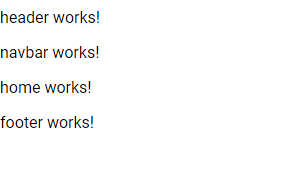
The header, navbar and footer content will be common between the home and about pages.
Now, let's add some placeholder content to our components and pages. Open the src/app/home/home.component.html file and add the following markup:
<h2>Home</h2>

<p>This demo is making use of CSS Grid layout for creating the layout.</p>
<p> Go to the `src/app/app.component.css` file for the CSS code of this layout.</p>
Next, open the src/app/about/about.component.html file and add the following markup:
<h2>About us</h2>
<p>This is the about page of our application.</p>
Next, open the src/app/navbar/navbar.component.html file and add the following markup:
<a  [routerLink]="['/home']">HOME</a>
<a  [routerLink]="['/about']">ABOUT US</a>
Next, open the src/app/header/header.component.html file and add the following markup;
<header>
    <h1>Angular App</h1>
</header>
Next, open the src/app/footer/footer.component.html file and add the following markup;
<footer>
    <span>
        Copyright 2019
    </span>
</footer>
Open the src/app/app.component.css file and add the following styles:
app-root {
    height: 100%;
    width: 100%;

    display: grid;
    grid-template-columns: 1fr;
    grid-template-rows: 100px max-content 1fr max-content;
    grid-template-areas:
      "header"
      "navbar"
      "main"
      "footer";
}

app-header {
    grid-area: header;
}

app-navbar {
    grid-area: navbar;
}

router-outlet + * {
    grid-area: main;
}

app-footer {
    grid-area: footer;
}
Open the src/app/header/header.component.css and add the following CSS code:
:host {
    background: #9154f3;
    color: whitesmoke;

    border-top: 0px solid #9154f3;
    font-size: 21px;
    font-weight: 500;
    line-height: 49px;
    border-bottom-width: 1px;
    padding: 0 17px;
}
Open the src/app/footer/footer.component.css file and add the following CSS code :
:host {
    background: #9154f3;
    color: whitesmoke;
    border-top: 1px solid #9154f3;
    padding: 9px 16px;
    box-sizing: border-box;
  }
Next, open the src/app/navbar/navbar.component.css and add the following CSS code :
:host {
    border: 0 solid #e1e1e1;
    border-bottom-width: 1px;
    height: 49px;
    padding: 0 16px;

    display: flex;
    flex-flow: row;
    align-items: center;
  }

  a {
    color: #c697d8;
    font-size: 19px;
    font-weight: 900;
    line-height: 49px;
    margin-right: 27px;
    text-decoration: none;
  }
Next, open the src/app/home/home.component.css and src/app/about/about.component.css files and add the following CSS code:
:host {
    padding: 3px 19px;
}
At this point, we would expect to get the correct layout but this is not actually what happens:
![}(https://www.diigo.com/file/image/rscqpoqzocbpdrbeozdsdrssdr/Angulardemo.jpg)
To solve this we need to apply ViewEncapsulation.None to the App component. Open the src/app/app.component.ts file and update as follows:
import { Component, ViewEncapsulation } from '@angular/core';

@Component({
  selector: 'app-root',
  templateUrl: './app.component.html',
  styleUrls: ['./app.component.css'],
  encapsulation: ViewEncapsulation.None
})
export class AppComponent {
}
This is a screenshot of our holy grail Angular UI:
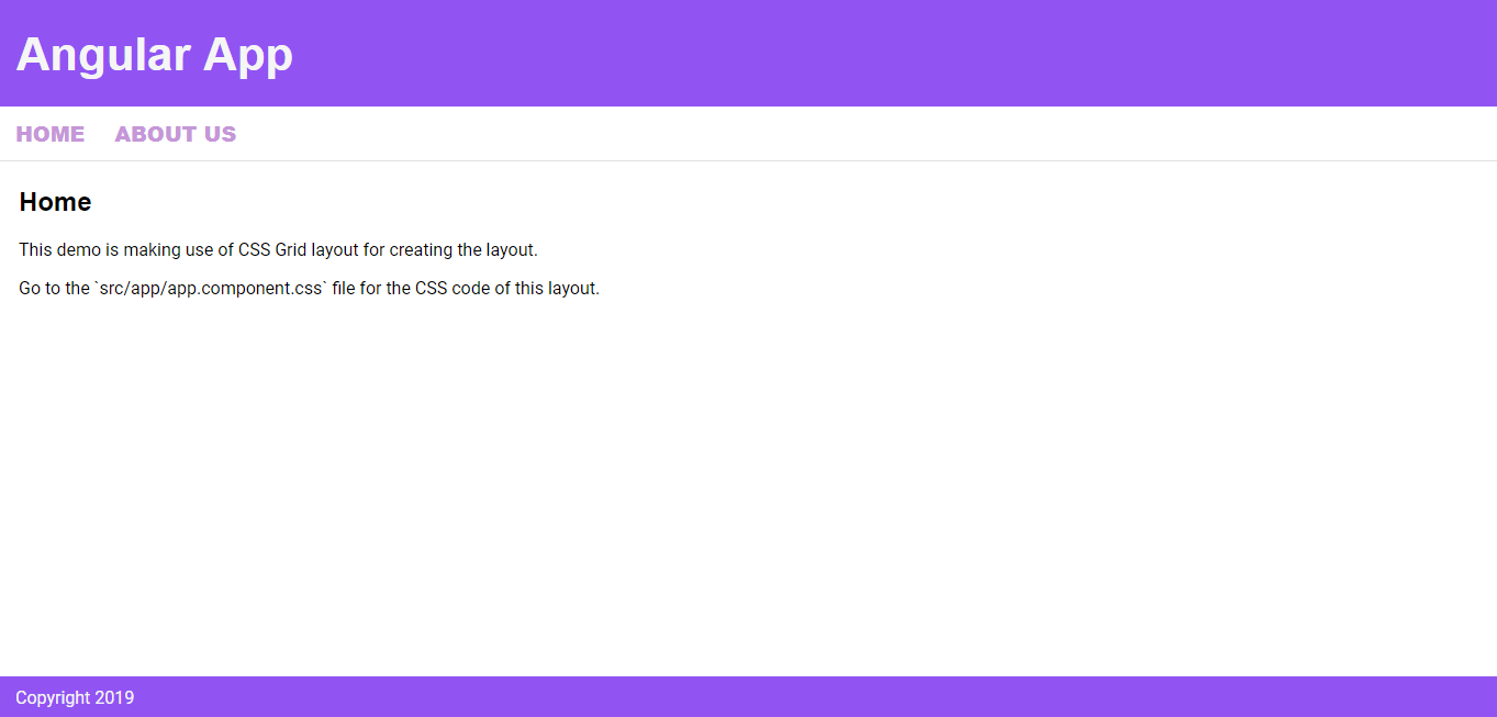
Conclusion
In this tutorial, we've introduced CSS Grid layout to Angular developers and seen the fundamental concepts of how to create modern layouts using it. Next, we've created a holy grail layout using CSS Grid and Angular 8.