Responsive Images Tutorial for Angular 7/8 Devs
In this tutorial, we'll first learn about responsive images and next we'll see how to use them in Angular 7/8.
Responsive images are a necessity in this interconnected world. A website needs to work well on multiple devices, as users may access your site through their phone, tablet or laptop. This tutorial will explain what are responsive images and provide some tips to help you apply them. We'll also see how to implement responsive images in Angular 7/8.
Note: Angular provides the BreakPoint Observer API which allows you to easily work with responsive images. It's part of the Layout Module that's part of the CDK (Component Dev Kit).
The Angular CDK contains powerful APIs for component development such as the
BreakpointObserverthat enables you to observe media-query breakpoints. In this way, Angular components can subscribe to screen-size changes and react accordingly. See a practical example below.
What Are Responsive Images?
While the idea of resizing images for the browser has been a part of web design from the start, simply resizing the images is not enough to provide the correct size and resolution required for multiple devices.
Therefore, we can define responsive imagery as the process for providing the browser with multiple image sources according to the display density, the size of the image element on the page, and the resolution required for the device. Put simply, it is the method used to ensure that images look optimal no matter what device they are displayed on.
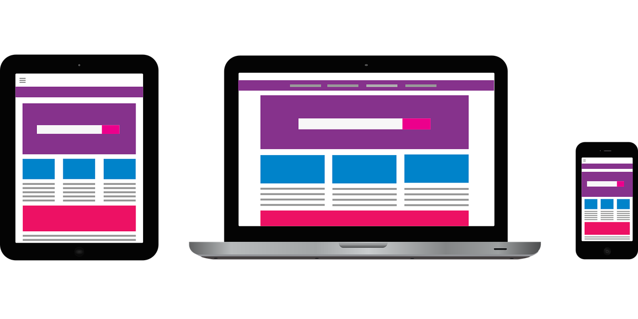
Let’s start with a few key concepts about responsive images. A typical website may contain a header image and some content images below the header. Usually the header image spans the whole width of the header, with the content image fitting inside the content column. While the image can work well when displayed on a larger site, for mobile devices the resolution is not going to be optimal. Therefore, most websites will have a “mobile version”.
See this example of Wikipedia travel site, Wikivoyage:

In this example, images are wide, high-quality and adapted to the large screen.

As you can see, the image for mobile web is much simpler and clean, adapted to the narrow frame.
Responsive Resolution Methods
This change of effect can be obtained through two methods: resolution switching and art direction.
Resolution switching
It is the most common use case, when you want to provide different sizes of an image without making modifications to the content or aspect of the image. The resolution switching also involves scenarios when you want to provide different image sources based on the display density, such as retina images.
Art direction
On the other hand, when you need to make changes to the aspect of an image, you need to use the art direction method. Take, for example, this picture of the Eiffel Tower:

It makes sense for this to be large so you can see the Eiffel Tower in the Paris skyline. However, when simply resized, this happens:
At this size, you can barely distinguish the Eiffel Tower, even less make out Paris skyline. Therefore, instead of simply resizing the image, it is better to crop the image to focus on the Eiffel Tower. This results in an image that works better at a smaller size:

However, art direction does not involve only cropping images, but changing the direction of an image; for example, from landscape to portrait based on the size of the screen.
Why Responsive Images Are Important
One of the reasons we need solutions for responsive images is because the <img> element is insufficient, as it only has one src and we need multiple sources for multiple devices.
However, even when there are new components such as <picture> and srcset, you need to use <img> regardless what responsive image solution you use. The <img> element is essential for all the inline responsive images solutions, since it is a box within all the responsive image rules are added and applied.
While talking about resizing, displaying a large image on a screen much smaller such as a mobile device can waste bandwidth by downloading a large image when a small image can do the same effect. So, it is very important to have multiple resolutions available, providing the right size depending on the device accessing the website data.
One possible solution might be to use vector images. However, while these are useful, they are not suitable for all image types. For example, you cannot create a vector-based image of a photo. For that matter, other image formats such as JPEG are more suitable.
Resizing and compatibility weren’t an issue until recently, with the widespread adoption of smartphones, tablets and other devices. Therefore, responsive image technologies and solutions are implemented by allowing you offer the browser a number of image files, with two options: showing the same thing but containing different numbers of pixels (resolution switching), or different images suitable for different display formats (art direction).
What are Image Breakpoints?
An image breakpoint is the point when the image source switches to the next size or resolution. For example, you may choose to have three image sources, small, medium and large, so you would need three breakpoints. When thinking about image breakpoints you should consider two things. First, how many image sources you need to provide to cover the range of sizes needed for this image usage. Second, the actual target and time usage of the image sources. One method you can use is to resize the browser until the page looks like it needs a breakpoint.
Since the reasons you need multiple image sources are mostly performance, different screen densities, you cannot reuse the responsive layout breakpoint for the images, since it is not going to look good.
Tips to Pick Image Breakpoints
There is not a single solution for picking the right image sources that you need. However, you can try the following tips that can provide some guidance:
Matching your layout breakpoints
For example, you think about matching mobile, tablet and desktop displays with small, medium and large image sources. You can also look at the number of layout breakpoints and match the image breakpoints. This method is quite inaccurate, and you will need to have more defined sizes for the image sources.
Testing representative images
Another method involves looking at some representative images and calculating how many breakpoints they need. This can be useful when all the photographs conform to a particular style or brand. You can pick a few images and resize them several times, covering your needs.
Set the image breakpoints according to a performance budget
You can define a budget limiting the amount of wasted bytes the browser would be allowed to download beside what is needed to fit the image. For example, you have a performance budget of 20K for each responsive image. This means that we need to configure the breakpoints so that the various sources are never more than 20K apart.
The Bottom Line
Working with responsive images is necessary to ensure a better customer experience for every visitor to your website. This, in turn, results in visitors returning to your site. However, responsive image technology requires skills and training. Using an image optimization solution can ease much of the hassle that comes with creating and managing responsive images. In this tutorial, I offered an overview to help you better understand the key concepts of responsive imagery, and provided some tips to get you started.